
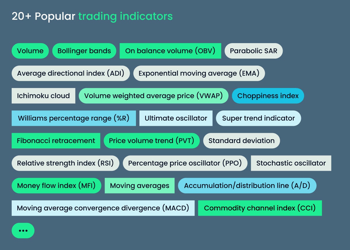
20. Other indicators
Read Time:31 Minute, 18 Second

Average Directional Index (ADX)
About:
The Average Directional Index (ADX), Minus Directional Indicator (-DI) and Directional Indicator (+DI) represent a group of directional movement indicators that form a trading system developed by Welles Wilder. The Average Directional Index (ADX) measures trend strength without regard to trend direction. The other two indicators, Plus Directional Indicator (+DI) and Minus Directional Indicator (-DI), complement ADX by defining trend direction. Used together, chartists can determine both the direction and strength of the trend. Source: stockcharts.com
What should you know?
- ADX system has three components – ADX, +DI, and -DI
- ADX is used to measure the strength/weakness of the trend and not the actual direction
- ADX above 25 indicates that the present trend is strong, ADX below 20 suggest that the trend lacks strength. ADX between 20 and 25 is a grey area
- A buy signal is generated when ADX is 25, and the +DI crosses over –DI
- A sell signal is generated when ADX is 25 and the –DI crosses over +DI
- Once the buy or sell signal is generated, take the trade by defining the stop loss.
- The stop loss is usually the low of the signal candle (for buy signals) and the high of the signal candles ( for short signals)
- The trade stays valid till the stoploss is breached (even if the +DI and –DI reverses the crossover)
- The default lookback period for ADX is 14 days.
On Kite:
Load the ADX indicator from studies. Kite gives you an option to change the lookback period; by default, the lookback period is set.

You can customize the colour of all the three components of the ADX system. Click on ‘create’ to load the indicator –

By default, the ADX indicator is loaded below the instrument. The black line represents ADX, ensure it is above 25 while looking for the crossovers.
Alligator Indicator
About:
An indicator designed to signal a trend absence, formation and direction. Bill Williams saw the alligator’s behaviour as an allegory of the market’s one: the resting phase is turning into the price-hunting as the alligator awakes so that to come back to sleep after the feeding is over. The longer the alligator is sleeping, the hungrier it gets and the stronger the market move will be. Source: infimarkets.com
What should you know?
- The Alligator indicator is overlaid on the price chart.
- The indicator comprises three simple moving averages – 13, 8, and 5-period averages are used.
- The 13 period MA refers to the Alligator’s jaw, 8 period MA refers to the Alligator’s teeth, and the 5 period MA refers to the Alligator’s lips.
- By default 13 MA is coloured blue, 8 MA is coloured red, and 5 MA is coloured green.
- A buy signal is generated when the following condition is satisfied –
- All three MA’s are separated.
- The price is above the 5MA, 5MA is above 8MA, and 8MA is above 13 MA.
- Once the above condition is satisfied, it means that the asset is trending up.
- When the uptrend is established, it is upto the trader to identify a good entry point within this trend.
- A sell signal is generated when the following condition is satisfied –
- All three MA’s are separated.
- The price is below the 5MA, 5MA is below 8MA, and 8MA is below 13 MA.
- Once the above condition is satisfied, it means that the asset is trending down.
- When the downtrend is established, it is upto the trader to identify a good entry point within this trend.
- Periods, when the 13, 8, and 5 MA are intervened (or moving flat), is considered a ‘no trader’ zone, and therefore the trader is advised to stay out of markets.
On Kite:
Load the Alligator indicator from the studies. As you can see, the moving averages’ default values are loaded, i.e. 13, 8, and 5.

As you can see, the indicator input also loads the ‘offset’ values for each MA. Default values also load these offset values. Offsetting or displacing the moving average reduces the number of whipsaws in the average. Needless to say that you can change the default values for moving average and offset to any value that you deem appropriate. Further, you can even customize the colour of each indicator to your preference.
Here is the snapshot of how the indicator looks when the indicator is overlaid on the chart. There are 2 instances when the sell condition is satisfied (highlighted in red) and 1 instance when the buy condition is satisfied (highlighted in blue).

Aroon
About:
Developed by Tushar Chande in 1995, Aroon is an indicator system that determines whether a stock is trending or not and how strong the trend is. “Aroon” means “Dawn’s Early Light” in Sanskrit. Change chose this name because the indicators are designed to reveal the beginning of a new trend. The Aroon indicators measure the number of periods since price recorded an x-day high or low. There are two separate indicators: Aroon-Up and Aroon-Down.
A 25-day Aroon-Up measures the number of days since a 25-day high. A 25-day Aroon-Down measures the number of days since a 25-day low. In this sense, the Aroon indicators are quite different from typical momentum oscillators, focusing on price relative to time. Aroon is unique because it focuses on time relative to price. Chartists can use the Aroon indicators to spot emerging trends, identify consolidations, define correction periods and anticipate reversals. Source: stockcharts.com
What should you know?
- The indicator measures the number of days since last high or low is made. Hence the indicator is a measure of time relative to the price.
- Aroon consists of two-component – Aroon up and Aroon Down.
- The default value for Aroon is 25 days. Aroon up measures the number of days since the last 25 day high occurred and Aroon down measures the number of days since the last 25 days low has occurred
- Both Aroon up and Aroon down are plotted side by side.
- Aroon Up/Down is lower bound to zero and upper bound to 100
- A buy is generated when Aroon up is above 50 and Aroon low is below 30
- A sell is generated when Aroon down is above 50, and Aroon up is below 30
On Kite:
Here is the snapshot of the indicator when loaded from studies –

As you can see, the default period is 14, feel free to change this to any number, you wish. 14 here represent the ‘number of days’. Remember if the period is 14; the Aroon measures the number of days since the stock made 14 days high/low.

As you can see both Aroon up and Aroon Down are plotted.
Aroon Oscillator
Aroon Oscillator is an extension of the Aroon indicator. The Aroon Oscillator measures the difference between the Aroon up and Aroon down and plots the difference in the form of an oscillator. The oscillator swings between -100 to +100, with the ‘0’ level as the centre point.
The snapshot below shows the Aroon Oscillator loaded on to the chart –

A reading above zero means that Aroon-Up is greater than Aroon-Down, which implies that prices make new highs more recently than new lows. Conversely, readings below zero indicate that Aroon-Down is greater than Aroon-Up. This implies that prices are recording new lows more recently than new highs.
As you can see, the Aroon Oscillator is either going to be positive or negative the vast majority of the time. This makes interpretation straight-forward—time and price favour an uptrend when the indicator is positive and a downtrend when it is negative. A positive or negative threshold can be used to define the strength of the trend. For example, a surge above +50 would reflect a strong upside move, while a plunge below -50 would indicate a strong downside move. Source: stockcharts.com
Average True Range
About:
Developed by J. Welles Wilder, the Average True Range (ATR) is an indicator that measures volatility. As with most of his indicators, Wilder designed ATR with commodities and daily prices in mind. Commodities are frequently more volatile than stocks. They were are often subject to gaps and limit moves, which occur when a commodity opens up or down its maximum allowed move for the session. A volatility formula based only on the high-low range would fail to capture volatility from gap or limit moves. Wilder created the Average True Range to capture this “missing” volatility. It is important to remember that ATR does not indicate the price direction, just volatility. Source: stockcharts.com
What should you know?
- Average True Range (ATR) is an extension of the True Range concept.
- ATR is no upper or lower bound, hence can take any value
- ATR is stock price specific, hence for Stock 1 ATR can be in the range of 1.2 and Stock 2 ATR could be in the range of 150
- ATR attempts to measure the volatility situation and not really the direction of the prices
- ATR is used to identify stop loss as well
- If the ATR of a stock is 48, then it means that the stock is likely to move 48 points either ways up or down on average. You can add this to the current day’s range to estimate the day’s range. For example, the stock price is 1320; then the stock is likely to trade between 1320 – 48 = 1272 and 1320 + 48 = 1368
- If the ATR for the next day decreases to say 40, then it means that the volatility is decreasing, and so is the expected range for the day.
- It is best to use ATR to identify the volatility-based SL while trading. Assume you have initiated a long trade on the stock at 1325, then your SL should be at least 1272 or below since the ATR is 48
- Likewise, if you have initiated a short at 1320, then your stoploss should be at least 1368 or above.
- If these SL levels are outside your risk to reward appetite, then its best to avoid such trade.
On Kite:
As you can see, the default value of ATR is 14, which means to say that the system calculates the ATR for the last 14 days. Of course, you can change this to any value to wish. Here is the snapshot –

Once you load the chart, ATR is plotted below the price chart as seen below –

So the next time you place a stoploss make sure you check the ATR value to see if stoploss level is relevant. You may also want to read more about volatility and its application (including volatility based SL) – Click Here.
Average True Range Band
The ATR bands are an extension of the ATR concept. The idea is to plot an envelope around the stock price to evaluate if the stock prices are behaving “normally” or trending in a particular direction. To do this, the ATR band calculates the upper and lower band.
What should you know?
- The ATR band calculates and plots the upper and lower envelope around the stock price.
- To begin with, a moving average of the stock price is calculated.
- The ATR value is added to the moving average value, and this forms the upper envelope.
- The ATR value is subtracted to the moving average value, and this forms the lower envelope.
- If the stock price penetrates either the upper or lower envelop, the expectation is that the stock price will continue to move in the same direction. For example, if the stock price has penetrated above the upper envelop, the expectation is that the stock will continue to move higher.
- You can even use the ATR bands as an alternative to the Bollinger Bands trading system. You can read more about the Bollinger Band (section 15.2)
On Kite:
When you load the ATR band from studies, you will be prompted for a few inputs –

Period refers to the MA time frame; the default value is 5 days. You can change this to whichever time frame that you deem suitable. We would suggest you ignore the ‘shift’ parameter. For the ‘field’ option select ‘close’, this means to say that you are plotting the MA values on the closing prices. The rest of the options are mainly aesthetic features, feel free to explore them. Once you click create, you will see the ATR bands plotted on the chart.

Super trend
Before understanding the supertrend indicator, understanding the ATR is necessary as the super trend employs ATR values to calculate the indicator values. The supertrend indicator is plotted over the price chart of the stock or the index. The indicator line changes its colour between green and red based on the price moment in the underlying. The super trend does not predict the direction, rather once the direction is established, it will guide you by initiating a position and suggesting that you stay in the position until the trend sustains.
What should you know?
- When plotted, the supertrend indicator appears like an alternating green and red continuous line.
- A buy signal is generated when the stock/index price turns greater than the indicator value. At this stage, the indicator colour turns green, and you can also see a crossover of the price versus the indicator (price greater than indicator value)
- Once the long position has been established, the trader is advised to hold the position till the price closes below the green line. So in a sense, the green line helps as a trailing stoploss for the long position.
- A sell signal is generated when the stock/index price turns lesser than the indicator value. At this stage, the indicator colour turns red, and you can also see a crossover of the price versus the indicator (price lesser than indicator value)
- The sell signal can be used to initiate a fresh short or exit long. Although waiting for the sell signal to exit the existing long position can sometimes lead to the loss. So the trader should use his discretion here.
- Once the short position has been established, the trader is advised to hold the position till the price closes below the green line. So in a sense, the red line helps as a trailing stoploss for the short position.
- Supertrend is basically used to identify a trend. Therefore, it works best in a trending market.
- The supertrend indicator, when compared to a regular Moving Average trading system generates fewer false signals; for this reason, the super trend indicator is preferred over a Moving Average trading system.
On Kite:
When you select the Supertrend indicator from the list of studies, you will be prompted for two inputs – Period and Multiplier.

Period refers to the ATR number of days. The default value on Kite is 7, which means that the system will calculate the ATR value for the last 7 days. You can input any value you deem suitable.
The multiplier refers to a value by which the ATR will get multiplied. The default value on Kite is 3, so whatever is the ATR value, it will get multiplied by 3. The multiplier is a crucial input for Super trend. If the multiplier value is too high, then a lesser number of signals are generated. Likewise, if the multiplier value is too small, then the frequency of signals increase, hence chances of generating false trading signals are quite high. I would suggest you keep this value between 3 and 4.
Once the indicator is plotted, this is how it appears on the chart –

Notice how the indicator changes the colour as the price moves. Also, whenever the buy/sell signal is generated, green and red arrows are generated (respectively) prompting the trader to go long or short on the stock.
Volume weighted average price (VWAP)
VWAP is one of the simplest indicators to use. It works on the principle of averaging the traded price in terms of volume traded. Let me give you an example to help you understand this better.
Here is how Infy traded between 14:30 and 14:35 on 2nd Nov 2016 –

The data is quite simple to understand; for example, at 14:32, 2475 shares were traded; it made a high of 983.95, low of 983, and closed the minute at 983.1.
Now, we use this data and compute the VWAP price. To do this, we calculate the following –
- Typical price = which is the average price of High, Low, and close
- Volume Price (VP) = we get this by multiplying the typical price with its volume.
- Total VP = This is a cumulative number, which is got by adding the current VP to the previous VP
- Total volume = This is again a cumulative number, which is got by adding the current volume to the previous volume.
- VWAP = We get this VWAP number by dividing the Total VP by Total Volume. The resulting number indicates the average traded price, weighted by volume.
Let’s do the math on Infy data –

As you see, the VWAP is a dynamic number, changing based on how the trades flow in.
How to use the VWAP?
- VWAP is an intraday indicator, use it on minute charts. Often when you plot this, you will notice a jump at 9:15 AM, when compared to previous day’s data. Ignore this jump as it means nothing
- VWAP is an average, and like any indicators employing averages, this too lags the current market price
- VWAP is used for 2 main reasons – to get a sense of intraday direction and to get a sense of the efficiency of order execution
- If the current price is below VWAP, then the general opinion is that the intraday trend is down.
- If the current price is above VWAP, then the general opinion is that the stock is trending higher.
- If the VWAP lies in between the high and low, then the expectation is that the stock will remain volatile.
- If you intend to short a stock, it is considered an efficient fill if you short the stock at a higher price than VWAP.
- Likewise, if you intend to go long on a stock, it is considered an efficient fill if you go long at a price lower than VWAP.
On Kite:
Open the chart of your preference and select VWAP from the studies dropdown –

Note, VWAP can be applied only on an intraday time frame and cannot be applied on EOD data.
Once you select the time frame (1 min, 5 mins, 10 mins etc.), the engine calculates the VWAP and plots it on the chart as an overlay.

You can now visualize the VWAP and the current market price and plan your trades accordingly.
Average Directional Index (ADX)
About:
The Average Directional Index (ADX), Minus Directional Indicator (-DI) and Directional Indicator (+DI) represent a group of directional movement indicators that form a trading system developed by Welles Wilder. The Average Directional Index (ADX) measures trend strength without regard to trend direction. The other two indicators, Plus Directional Indicator (+DI) and Minus Directional Indicator (-DI), complement ADX by defining trend direction. Used together, chartists can determine both the direction and strength of the trend. Source: stockcharts.com
What should you know?
- ADX system has three components – ADX, +DI, and -DI
- ADX is used to measure the strength/weakness of the trend and not the actual direction
- ADX above 25 indicates that the present trend is strong, ADX below 20 suggest that the trend lacks strength. ADX between 20 and 25 is a grey area
- A buy signal is generated when ADX is 25, and the +DI crosses over –DI
- A sell signal is generated when ADX is 25 and the –DI crosses over +DI
- Once the buy or sell signal is generated, take the trade by defining the stop loss.
- The stop loss is usually the low of the signal candle (for buy signals) and the high of the signal candles ( for short signals)
- The trade stays valid till the stoploss is breached (even if the +DI and –DI reverses the crossover)
- The default lookback period for ADX is 14 days.
On Kite:
Load the ADX indicator from studies. Kite gives you an option to change the lookback period; by default, the lookback period is set.
You can customize the colour of all the three components of the ADX system. Click on ‘create’ to load the indicator –
By default, the ADX indicator is loaded below the instrument. The black line represents ADX, ensure it is above 25 while looking for the crossovers.
Alligator Indicator
About:
An indicator designed to signal a trend absence, formation and direction. Bill Williams saw the alligator’s behaviour as an allegory of the market’s one: the resting phase is turning into the price-hunting as the alligator awakes so that to come back to sleep after the feeding is over. The longer the alligator is sleeping, the hungrier it gets and the stronger the market move will be. Source: infimarkets.com
What should you know?
- The Alligator indicator is overlaid on the price chart.
- The indicator comprises three simple moving averages – 13, 8, and 5-period averages are used.
- The 13 period MA refers to the Alligator’s jaw, 8 period MA refers to the Alligator’s teeth, and the 5 period MA refers to the Alligator’s lips.
- By default 13 MA is coloured blue, 8 MA is coloured red, and 5 MA is coloured green.
- A buy signal is generated when the following condition is satisfied –
- All three MA’s are separated.
- The price is above the 5MA, 5MA is above 8MA, and 8MA is above 13 MA.
- Once the above condition is satisfied, it means that the asset is trending up.
- When the uptrend is established, it is upto the trader to identify a good entry point within this trend.
- A sell signal is generated when the following condition is satisfied –
- All three MA’s are separated.
- The price is below the 5MA, 5MA is below 8MA, and 8MA is below 13 MA.
- Once the above condition is satisfied, it means that the asset is trending down.
- When the downtrend is established, it is upto the trader to identify a good entry point within this trend.
- Periods, when the 13, 8, and 5 MA are intervened (or moving flat), is considered a ‘no trader’ zone, and therefore the trader is advised to stay out of markets.
On Kite:
Load the Alligator indicator from the studies. As you can see, the moving averages’ default values are loaded, i.e. 13, 8, and 5.
As you can see, the indicator input also loads the ‘offset’ values for each MA. Default values also load these offset values. Offsetting or displacing the moving average reduces the number of whipsaws in the average. Needless to say that you can change the default values for moving average and offset to any value that you deem appropriate. Further, you can even customize the colour of each indicator to your preference.
Here is the snapshot of how the indicator looks when the indicator is overlaid on the chart. There are 2 instances when the sell condition is satisfied (highlighted in red) and 1 instance when the buy condition is satisfied (highlighted in blue).
Aroon
About:
Developed by Tushar Chande in 1995, Aroon is an indicator system that determines whether a stock is trending or not and how strong the trend is. “Aroon” means “Dawn’s Early Light” in Sanskrit. Change chose this name because the indicators are designed to reveal the beginning of a new trend. The Aroon indicators measure the number of periods since price recorded an x-day high or low. There are two separate indicators: Aroon-Up and Aroon-Down.
A 25-day Aroon-Up measures the number of days since a 25-day high. A 25-day Aroon-Down measures the number of days since a 25-day low. In this sense, the Aroon indicators are quite different from typical momentum oscillators, focusing on price relative to time. Aroon is unique because it focuses on time relative to price. Chartists can use the Aroon indicators to spot emerging trends, identify consolidations, define correction periods and anticipate reversals. Source: stockcharts.com
What should you know?
- The indicator measures the number of days since last high or low is made. Hence the indicator is a measure of time relative to the price.
- Aroon consists of two-component – Aroon up and Aroon Down.
- The default value for Aroon is 25 days. Aroon up measures the number of days since the last 25 day high occurred and Aroon down measures the number of days since the last 25 days low has occurred
- Both Aroon up and Aroon down are plotted side by side.
- Aroon Up/Down is lower bound to zero and upper bound to 100
- A buy is generated when Aroon up is above 50 and Aroon low is below 30
- A sell is generated when Aroon down is above 50, and Aroon up is below 30
On Kite:
Here is the snapshot of the indicator when loaded from studies –
As you can see, the default period is 14, feel free to change this to any number, you wish. 14 here represent the ‘number of days’. Remember if the period is 14; the Aroon measures the number of days since the stock made 14 days high/low.
As you can see both Aroon up and Aroon Down are plotted.
Aroon Oscillator
Aroon Oscillator is an extension of the Aroon indicator. The Aroon Oscillator measures the difference between the Aroon up and Aroon down and plots the difference in the form of an oscillator. The oscillator swings between -100 to +100, with the ‘0’ level as the centre point.
The snapshot below shows the Aroon Oscillator loaded on to the chart –
A reading above zero means that Aroon-Up is greater than Aroon-Down, which implies that prices make new highs more recently than new lows. Conversely, readings below zero indicate that Aroon-Down is greater than Aroon-Up. This implies that prices are recording new lows more recently than new highs.
As you can see, the Aroon Oscillator is either going to be positive or negative the vast majority of the time. This makes interpretation straight-forward—time and price favour an uptrend when the indicator is positive and a downtrend when it is negative. A positive or negative threshold can be used to define the strength of the trend. For example, a surge above +50 would reflect a strong upside move, while a plunge below -50 would indicate a strong downside move. Source: stockcharts.com
Average True Range
About:
Developed by J. Welles Wilder, the Average True Range (ATR) is an indicator that measures volatility. As with most of his indicators, Wilder designed ATR with commodities and daily prices in mind. Commodities are frequently more volatile than stocks. They were are often subject to gaps and limit moves, which occur when a commodity opens up or down its maximum allowed move for the session. A volatility formula based only on the high-low range would fail to capture volatility from gap or limit moves. Wilder created the Average True Range to capture this “missing” volatility. It is important to remember that ATR does not indicate the price direction, just volatility. Source: stockcharts.com
What should you know?
- Average True Range (ATR) is an extension of the True Range concept.
- ATR is no upper or lower bound, hence can take any value
- ATR is stock price specific, hence for Stock 1 ATR can be in the range of 1.2 and Stock 2 ATR could be in the range of 150
- ATR attempts to measure the volatility situation and not really the direction of the prices
- ATR is used to identify stop loss as well
- If the ATR of a stock is 48, then it means that the stock is likely to move 48 points either ways up or down on average. You can add this to the current day’s range to estimate the day’s range. For example, the stock price is 1320; then the stock is likely to trade between 1320 – 48 = 1272 and 1320 + 48 = 1368
- If the ATR for the next day decreases to say 40, then it means that the volatility is decreasing, and so is the expected range for the day.
- It is best to use ATR to identify the volatility-based SL while trading. Assume you have initiated a long trade on the stock at 1325, then your SL should be at least 1272 or below since the ATR is 48
- Likewise, if you have initiated a short at 1320, then your stoploss should be at least 1368 or above.
- If these SL levels are outside your risk to reward appetite, then its best to avoid such trade.
On Kite:
As you can see, the default value of ATR is 14, which means to say that the system calculates the ATR for the last 14 days. Of course, you can change this to any value to wish. Here is the snapshot –
Once you load the chart, ATR is plotted below the price chart as seen below –
So the next time you place a stoploss make sure you check the ATR value to see if stoploss level is relevant. You may also want to read more about volatility and its application (including volatility based SL) – Click Here.
Average True Range Band
The ATR bands are an extension of the ATR concept. The idea is to plot an envelope around the stock price to evaluate if the stock prices are behaving “normally” or trending in a particular direction. To do this, the ATR band calculates the upper and lower band.
What should you know?
- The ATR band calculates and plots the upper and lower envelope around the stock price.
- To begin with, a moving average of the stock price is calculated.
- The ATR value is added to the moving average value, and this forms the upper envelope.
- The ATR value is subtracted to the moving average value, and this forms the lower envelope.
- If the stock price penetrates either the upper or lower envelop, the expectation is that the stock price will continue to move in the same direction. For example, if the stock price has penetrated above the upper envelop, the expectation is that the stock will continue to move higher.
- You can even use the ATR bands as an alternative to the Bollinger Bands trading system. You can read more about the Bollinger Band (section 15.2)
On Kite:
When you load the ATR band from studies, you will be prompted for a few inputs –
Period refers to the MA time frame; the default value is 5 days. You can change this to whichever time frame that you deem suitable. We would suggest you ignore the ‘shift’ parameter. For the ‘field’ option select ‘close’, this means to say that you are plotting the MA values on the closing prices. The rest of the options are mainly aesthetic features, feel free to explore them. Once you click create, you will see the ATR bands plotted on the chart.
Super trend
Before understanding the supertrend indicator, understanding the ATR is necessary as the super trend employs ATR values to calculate the indicator values. The supertrend indicator is plotted over the price chart of the stock or the index. The indicator line changes its colour between green and red based on the price moment in the underlying. The super trend does not predict the direction, rather once the direction is established, it will guide you by initiating a position and suggesting that you stay in the position until the trend sustains.
What should you know?
- When plotted, the supertrend indicator appears like an alternating green and red continuous line.
- A buy signal is generated when the stock/index price turns greater than the indicator value. At this stage, the indicator colour turns green, and you can also see a crossover of the price versus the indicator (price greater than indicator value)
- Once the long position has been established, the trader is advised to hold the position till the price closes below the green line. So in a sense, the green line helps as a trailing stoploss for the long position.
- A sell signal is generated when the stock/index price turns lesser than the indicator value. At this stage, the indicator colour turns red, and you can also see a crossover of the price versus the indicator (price lesser than indicator value)
- The sell signal can be used to initiate a fresh short or exit long. Although waiting for the sell signal to exit the existing long position can sometimes lead to the loss. So the trader should use his discretion here.
- Once the short position has been established, the trader is advised to hold the position till the price closes below the green line. So in a sense, the red line helps as a trailing stoploss for the short position.
- Supertrend is basically used to identify a trend. Therefore, it works best in a trending market.
- The supertrend indicator, when compared to a regular Moving Average trading system generates fewer false signals; for this reason, the super trend indicator is preferred over a Moving Average trading system.
On Kite:
When you select the Supertrend indicator from the list of studies, you will be prompted for two inputs – Period and Multiplier.
Period refers to the ATR number of days. The default value on Kite is 7, which means that the system will calculate the ATR value for the last 7 days. You can input any value you deem suitable.
The multiplier refers to a value by which the ATR will get multiplied. The default value on Kite is 3, so whatever is the ATR value, it will get multiplied by 3. The multiplier is a crucial input for Super trend. If the multiplier value is too high, then a lesser number of signals are generated. Likewise, if the multiplier value is too small, then the frequency of signals increase, hence chances of generating false trading signals are quite high. I would suggest you keep this value between 3 and 4.
Once the indicator is plotted, this is how it appears on the chart –
Notice how the indicator changes the colour as the price moves. Also, whenever the buy/sell signal is generated, green and red arrows are generated (respectively) prompting the trader to go long or short on the stock.
Volume weighted average price (VWAP)
VWAP is one of the simplest indicators to use. It works on the principle of averaging the traded price in terms of volume traded. Let me give you an example to help you understand this better.
Here is how Infy traded between 14:30 and 14:35 on 2nd Nov 2016 –
The data is quite simple to understand; for example, at 14:32, 2475 shares were traded; it made a high of 983.95, low of 983, and closed the minute at 983.1.
Now, we use this data and compute the VWAP price. To do this, we calculate the following –
- Typical price = which is the average price of High, Low, and close
- Volume Price (VP) = we get this by multiplying the typical price with its volume.
- Total VP = This is a cumulative number, which is got by adding the current VP to the previous VP
- Total volume = This is again a cumulative number, which is got by adding the current volume to the previous volume.
- VWAP = We get this VWAP number by dividing the Total VP by Total Volume. The resulting number indicates the average traded price, weighted by volume.
Let’s do the math on Infy data –
As you see, the VWAP is a dynamic number, changing based on how the trades flow in.
How to use the VWAP?
- VWAP is an intraday indicator, use it on minute charts. Often when you plot this, you will notice a jump at 9:15 AM, when compared to previous day’s data. Ignore this jump as it means nothing
- VWAP is an average, and like any indicators employing averages, this too lags the current market price
- VWAP is used for 2 main reasons – to get a sense of intraday direction and to get a sense of the efficiency of order execution
- If the current price is below VWAP, then the general opinion is that the intraday trend is down.
- If the current price is above VWAP, then the general opinion is that the stock is trending higher.
- If the VWAP lies in between the high and low, then the expectation is that the stock will remain volatile.
- If you intend to short a stock, it is considered an efficient fill if you short the stock at a higher price than VWAP.
- Likewise, if you intend to go long on a stock, it is considered an efficient fill if you go long at a price lower than VWAP.
On Kite:
Open the chart of your preference and select VWAP from the studies dropdown –
Note, VWAP can be applied only on an intraday time frame and cannot be applied on EOD data.
Once you select the time frame (1 min, 5 mins, 10 mins etc.), the engine calculates the VWAP and plots it on the chart as an overlay.
You can now visualize the VWAP and the current market price and plan your trades accordingly.
Courtsey To : Zerodha
Happy
0 %
Sad
0 %
Excited
0 %
Sleepy
0 %
Angry
0 %
Surprise
0 %


Average Rating